Flat design is all the rage these days and there are style guides all over the internet on how to set up your new site with the latest layouts, fonts and menus, there’s one area that most of these guides neglect: forms.
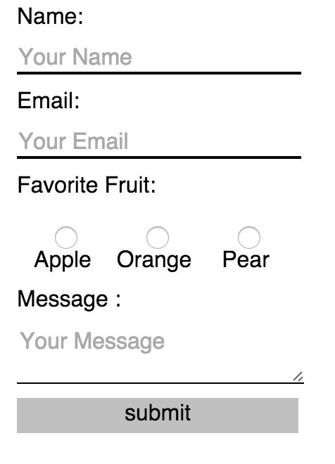
So, here’s an easy guide to making a few simple css tweaks that’ll give you flat forms. You could even set up a snippet without too much trouble that’ll take care of all of this for you if you find yourself needing to work with forms often.
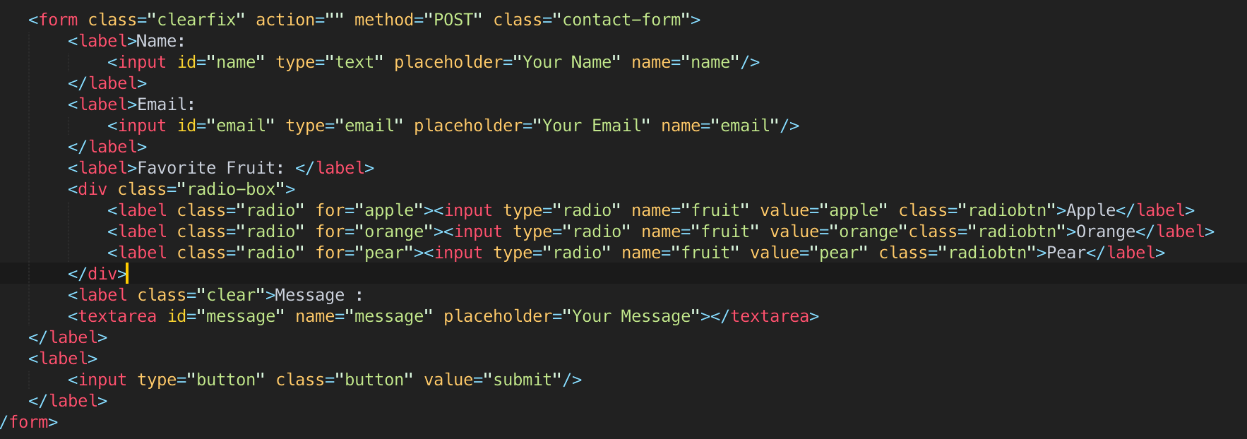
- Let’s set up some basic HTML and just look at it in a browser.


Ick. Round buttons, uneven widths, and borders all over the place.
2. Let’s plug in normalize.css and see how that changes things. Most of the sites you work with will probably be working with Normalize, so this is probably a pretty safe bet to see how it’s going to be looking:

I mean… It’s a little better. At least the font’s been changed. Not a total loss. It’s not great, but we’re just beginning.
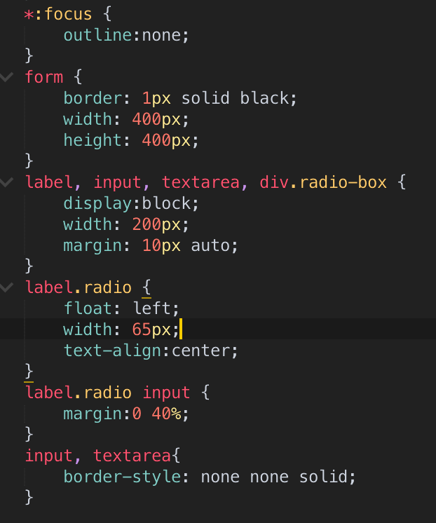
3. Alright, let’s start with our own CSS.

One thing we immediately want to do is to set every label element to sit on its own line, so we’ll add ‘display:block’ there, and we probably want those labels to sit above the inputs, so we will add ‘display:block’ to those as well. I’ve just wrapped a div around the radio buttons so they can sit on their own row—doing so allows them to be floated and have their positions set much more easily than just working with them on their own.
Very important is ‘*:focus {outline:none}’, which removes the outlines that normally are added by the browser when you click in to an input to enter text.
There’s some basic presentation styles here, too, namely assigning a single width to all of the inputs and the submit button and removing all input borders save the bottom one.

I’ve set this styling up as a Sublime Text Snippet you can download here. If you just add this to your Sublime settings and hit .flatform then the tab key, you’ll get this styling on all the forms on your page. Feel free to take this and run with it as you’d like—my next steps would be all color and hover-based, as well as making the dimensions of the form and div elements match my web page. With this CSS snippet, though, you should find it very easy to keep your forms’ styling in line with the rest of your beautifully-designed flat website.
As well, if you need more inspiration–or documentation–here’s Google’s latest Material Design specification for inputs: https://www.google.com/design/spec/components/text-fields.html