PSD to HTML Conversion

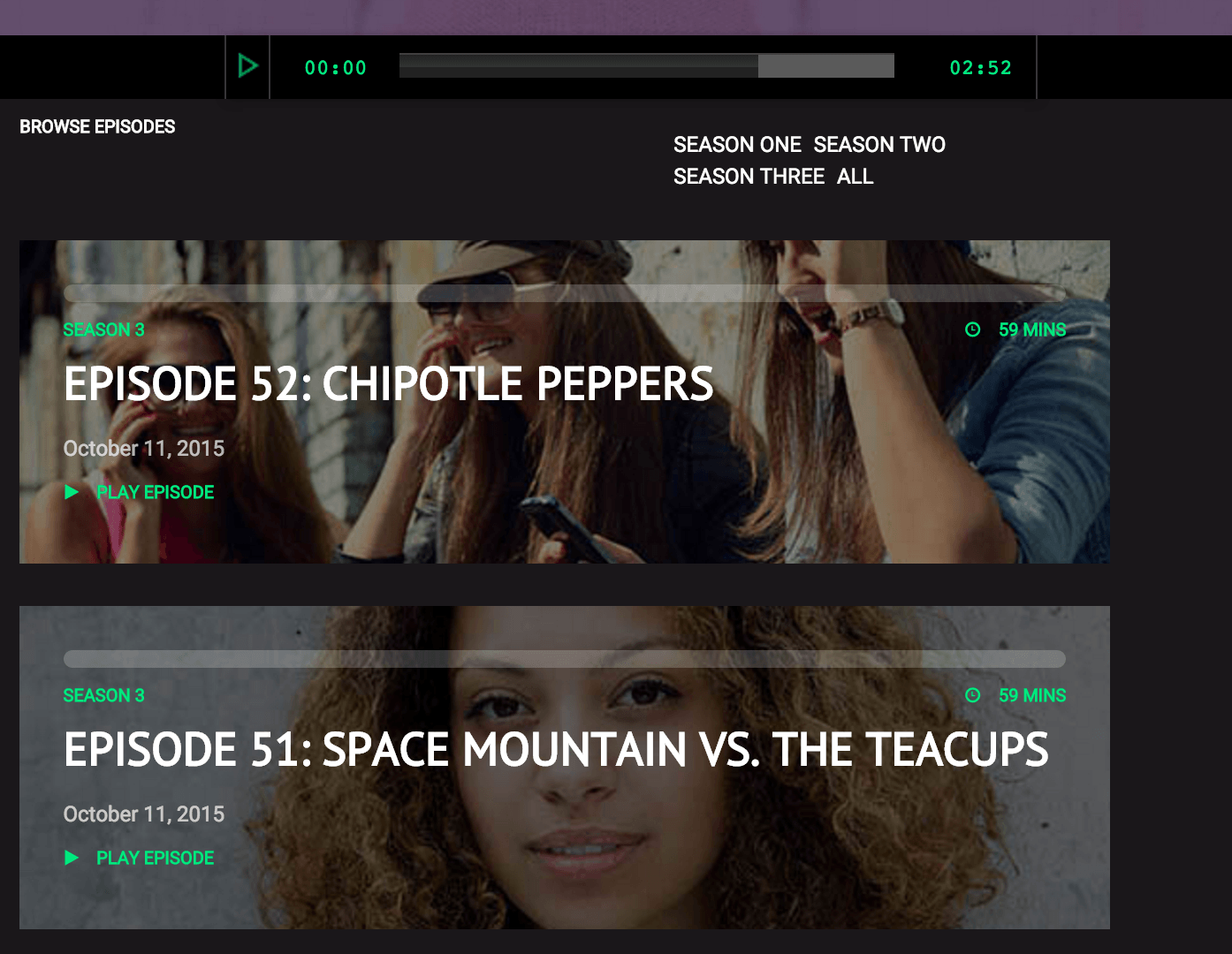
This is a PSD-to-Responsive-HTML conversion I did for a podcast home page as part of Hackeryou’s Front-End Bootcamp.
This was a great opportunity to work with Flexbox, Sass and jQuery plugins, honing my skills doing responsive designs that adapt to any browser width, bringing this podcast to as wide an audience as possible.
Thinking of the responsive aspects, I tried to keep it optimized for whatever device the user was viewing it on–the needs of a user on mobile are very different than those of someone on a tablet, for instance.